
Strategy Challange
Strategy Challange
Strategy Challange
Strategy Challange

Target Audience: Process Analyst
Tools: Figma , Figma Make , Claude

Delivery Date: Feb 12th , 5pm
Duration: 1 Week /after work
Brief

Goal
Redesign an efficient and trustworthy process analysis dashboard with a vision for future AI integration.
Problem
Technical: Marie needs a dashboard that delivers not just data, but intelligence, so she spends less time manually reorganising information to uncover the "stories" and "struggles" that justify the need for digital transformation.
Trust: Marie needs to understand where the data and suggestions come from, so she can confidently trust what she presents to others.
Scope
Build flexible, explainable controls to order, sort, rank, and group process data — applicable across pivot tables and visualizations. Identify opportunities for future improvements, AI automation, and augmented analytics.
Reference Material
Use the provided dashboard examples as reference points.
Deliverables
A low-fidelity user flow diagram demonstrating the interactions required to manipulate dashboard data.
Device
Desktop only, given time constraints.
Check the full Briefing here
Summary
Research
Before beginning the design process, there was a lot to discover: understanding Marie's needs, the data, the scope of the task, and the scale of the dataset. This foundation helped me develop informed hypotheses with global impact.
Personas

Marie, The process Analyst
I need to see where this data is coming from, verify it's correct, and confirm I can present it to stakeholders on the spot"
Current Responsibility
Builds executive and operational dashboards to drive digital transformation.
Collaboration needs
She needs a flexible data system that she can reorganize on the spot. She needs to quickly adapt the dashboard data to the scope of the meeting, present, and share her work without changing tools.
Operational Needs
She needs a flexible dashboard to handle both "Strategic Planning" (Macro view / Trends) and "Daily Operations" (Micro view / Filtering specific failures). She needs to understand certain KPIs immediately when she enters the page (big failures, risks and potential investment opportunities) and she needs to deep dive into the reasoning behind these numbers.
Component needs
She needs flexible, explainable controls to order, sort, rank, and group process data. She needs to filter data to present to different teams and stakeholders
Trust needs
She needs to be able to check in detail whether this data is reliable to present
Future AI Needs (3–5 Years)
Shift from manually building every aspect of a dashboard to orchestrating them. Marie needs a flexible and explainable system to manage AI sorts and ranks and validate AI suggestions so she can ensure the data is accurate before presenting it.
Marie's Needs

I start by interviewing Marie (Claude) and grouping all qualitative feedback. Here are some of the questions:
-
What does Marie use these dashboards for?
-
What are the different scenarios and teams that need her feedback?
-
How does Marie navigate this page? What are her priorities, and why?
-
Why does she need to order, sort, filter, and rank?
-
How can we group this data in helpful ways?
-
How does she present her results? Does she need other apps?
-
Are there any needs not being met? What could help reduce her daily effort?
-
Is there any frustration with the current design? What would she improve right away?
-
Does she have any other expectations? Are there examples she could draw inspiration from?
-
What is her biggest dream for AI? Does she see value in automation alone, or also in augmentation?
-
Are there any AI-related worries we need to consider?
Check the full interview here
The Data types

There's a lot to understand in the given data. I start by researching to clarify the meaning behind it and the connections between data points (Claude), so we can understand how to help Marie:
-
What is "Total Process Instances"?
-
Why does Marie group the information by status, department, or type?
-
What can we see in the process volume trend?
-
What is the difference between SLA and Compliance Rate?
-
Why does she need cycle time and average duration?
-
How do you identify the biggest failures and risks?
-
How do you choose between automation, hiring, or allocating? What is the impact formula?
See all information in Figma board
Logic Behind the Data

With Marie's needs mapped out, the next step was to deeply understand the logic behind the dashboard's data, not just what it shows, but why each action matters.
Three key questions shaped this phase:
-
What information does Marie need to group?
Marie organizes data by department, SLA compliance, status, and process type. Each grouping serves a different meeting context. Understanding which groupings unlock which stories was essential to designing the right controls. -
Why does sorting matter, and by what?
Sorting isn't just organization. For Marie, sorting by SLA reveals compliance risk, while sorting by instances reveals business impact. The challenge was designing a system that makes both visible without forcing her to choose between them. -
How can AI support Marie in the future?
Rather than replacing her judgment, AI should reduce the time she spends hunting for patterns — surfacing anomalies, predicting bottlenecks, and flagging automation opportunities. The key constraint: Marie needs to understand and trust every suggestion before approving it or presenting it to stakeholders.
Quantitative Data

To validate what I'd learned from Marie and ensure the design decisions would hold up beyond a single user, I moved into quantitative research, testing assumptions at scale and narrowing down design options before committing to an MVP.
Survey
After the conversation with Marie and gathering information, I needed to clarify some questions with users and get quantitative feedback (Figma board). This way, we could see if the changes would have a global impact.
Preference Test
I would like to preference-test some designs to curate the MVP solution before development starts.
See all survey question ideas here
Main Hypotheses

After all the interviews and investigation into users' analytical needs, the next step was to map and prioritize the assumptions, transforming them into hypotheses ranked by effort and impact. In a real scenario, it would be helpful to have business and developer insights on the table as well.
Main Hypotheses
-
As a user, I need to sort by SLA, total instances, and low values, to find not only risky or impactful processes but also neglected or hidden ones.
-
As a user, I need to group by department and group by SLA, to handle several meetings without needing heavy preparation.
-
As a user, I need a well-curated sort by impact, to look into hidden cases without wasting so much time searching.
-
As a user, I need to order the category rows of the table, so it's easy to compare values, present, and digest information for more scoped decisions.
-
As a user, I need findings, predictions, and solutions from AI, so I don't waste so much time analyzing.
-
As a user, I need promoted filters and advanced filters, so it's easy to surface hidden results.
see all user needs here
Ideation
With the main hypotheses mapped out, the next step was to ideate the main solutions. Creating wireframes and user flows helped to visualise ideas more clearly. I also used Figma Make to speed up the process.
Wireframes and flows

With the hypotheses prioritized, I translated them into concrete features and interactions, mapping out the key flows and wireframes that would let Marie sort, group, rank, and filter her data without losing control or trust in what she's seeing.
Table Sorting:
Add sort options to all columns.
Table Grouping (dropdown menu):
Add a grouping menu to group the table by department and SLA. In the future, we can add more groupings as suggested by Marie (status, type, compliance).
Table Ordering (drag and drop):
Add a drag-and-drop option so rows can be reordered without breaking the sorting logic.
Table Ranking (SLA and impact):
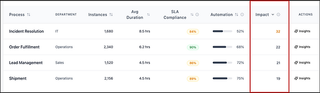
Add colorful chips and a column for the new impact logic (low automation, high instances, high SLA).
AI Mode:
A button so users can switch modes and access insights, recommendations, and automation across metric cards, the table, and graphics.
Table Filter (extra feature):
Add promoted filters so it's easy to filter the ones used every day, sometimes more than once. Add advanced filters so Marie can easily surface specific results in the table.
See all flows mapped here, and the videos of the flows below.
Flows & Videos
To make these flows tangible, I recorded short walkthroughs of each interaction in action, showing how sorting, grouping, ordering, and filtering the dashboard table come together in the actual prototype.
As a user, I need to be able to sort the table values to easily find and organize data. This way, I can quickly find risky or impactful processes, as well as neglected or hidden ones.


Extra Flows

Analysing Marie's feedback, there was a clear need to introduce filters as an extra solution, even though it was not required specifically
Promoted Filters
Add promoted filters to scope the table easily. We give priority to SLA as it is considered the most important metric for ROI. In the future, we can consider adding other metrics.
Advanced Filters
Add ranges to specific filters so users can select ranges individually and find hidden cases.
Page Department Filter
Add a filter at the top of the page to filter all content by department, making it easy for Marie to quickly adapt the presentation to different meetings.
As a user, I need a faster way to deep dive into card and graphic insights.

Look and Feel
With the flows defined, I moved into visual design — translating the wireframes into high-fidelity mockups and interactive prototypes that reflect the tone, clarity, and trust the dashboard needs to convey.


Design review
The design process is rarely final. Through building and testing the prototype, a number of considerations emerged that go beyond the current scope. These are not gaps, but natural next steps that would be revisited through continuous iteration, informed by testing, user feedback, and alignment with the broader team before moving into the next phase (developers, business stakeholders, and fellow designers).
Iterations cycles
Design doesn't end at handoff. I've gathered my own observations from the process, but in a real scenario these cycles would expand to include the full team, making each iteration more informed and the final solution more robust.
You can play around with the prototype
.png)
Next steps
Every project reveals as much about what comes next as it does about what's been built. These are the ideas and directions that emerged throughout the process, features, improvements, and open questions that would shape the next phase of the product.
Problem
As an Analyst, I wanna be able to see the same layout but black for comfort reasons
Scope
We want to add dark mode view :
-
new color range
-
accessibility check

.png)


User test
Every project reveals as much about what comes next as it does about what's been built. These are the ideas and directions that emerged throughout the process, features, improvements, and open questions that would shape the next phase of the product.
Problem
As an analyst, I need to be aware of predicted danger and great opportunities for impact, but we need to be sure we have the right query/metric
Scope
We want to understand if this is helpful for the quantity number of users and the right metric.
Pendencies
-
The rank score needs to be tested and accepted by user surveys and interviews)
-
The query needs to be smartly defined, avoiding traps, not just low SLA and low automation, but a combination with instance numbers, so we have eg. "Automation Opportunity" (High Volume + Low Automation Rate).
-
We need to AB test the design to see if the majority of users like this function
-
We want to give the user a way to add their own impact query


Conclusion
Every project leaves you with more than just a delivered design; it leaves you with sharper instincts, clearer blind spots, and a better sense of what you'd do differently next time. This section captures exactly that: the improvements I'd make to the process, the learnings that came from diving into an unfamiliar domain, and the broader reflections that shaped this challenge from start to finish.
IMPROVEMENTS:
-
Ai is a big help with exploration but is challenging to know where to stop. It's great for variations but not for deliveries. Even when asked to be truthful to the delivered documents, it hallucinates and adds extra information, elaborate features, or designs that are not supposed to be there. It can be risky if we are not aware of what is not supposed to be there.
-
Figma Make can not be embedded (ATM)
-
I missed the benchmarks and the study of the solutions already existing that normally helps to speed the process, but I needed to prioritise cause time was short.
LEARNINGS:
-
The topic was completely new, so I needed to investigate a lot of concepts to understand the logic for sorting, ranking, ordering, and filtering in an analytic page
CONCLUSIONS:
-
Doing design challenges while working demands a lot of discipline and planning ahead.
-
One of the biggest challenges was creating a single interface that serves two opposing mindsets: the Micro-View (Operating daily tasks/firefighting specific failures) and the Macro-View (Presenting strategic trends to the Board).
-
I realized that designing these features, you really need a strong storytelling to understand the purpose.
-
Overall a great challenge, can’t wait to know your opinion…